Friday, July 15, 2011
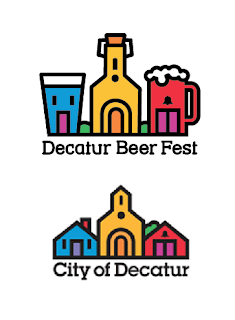
Decatur Beer Fest Logo
Anyone who lives in Atlanta has probably seen the "City of Decatur" logo. In a contest for the Decatur Beer Fest logo this year I came up with this based on that design. Unfortunately the City of Decatur would not allow it to be submitted for being too close to their logo. A cryin' shame if you ask me.
Thursday, November 18, 2010
Supply Chain Illustration
This is an illustration for a company called Movement Technologies. They deal with supply chain logistics. They needed a visual for their website, and other marketing materials, that would convey the idea that their software provides a new and improved way of doing business. I thought I would share the illustration process from beginning to end.
The first step...After our initial conversation, I provide a rough concept for the client to sign off on. This helps us both get on the same page before I move forward with the fully rendered illustration.
Next I make an attempt to capture the vision they had in mind. In this case they liked it, but felt is was too artistic, ominous. They wanted something that felt more realistic and identifiable to the client. This conversation lead to the final draft shown above.
All in all, they were very happy with it which of course makes me very happy. Thank you for
taking the time to look, and stay tuned for more to come.
Thursday, November 4, 2010
Wednesday, November 3, 2010
Re-Branding
This project involved the rebranding of Shreeps Music. A local artist of Atlanta. These are the options I presented to him.
Tuesday, October 26, 2010
Book Cover Redesign
I am taking a Typography class at the Creative Circus. This project called for the redesign of a book cover. I chose The Tao of Willie. The top image is the original. The bottom is my redesign.
Typography Portraits
These are portraits that consist entirely of font letters. In some cases the letters were used to create a contrast value (Hendrix). In others the letters were used as actual shapes for the facial features. But all the letters were kept in their true form (ie...no stretching, modifying the shape, etc..)
The Clint Eastwood is my favorite. I was not sure how that would turn out, but it came together quick and (I think) captured his essence pretty well.
The Clint Eastwood is my favorite. I was not sure how that would turn out, but it came together quick and (I think) captured his essence pretty well.
Welcome to 7thSense Designs!
If you are reading this then you have found your way through the vast blogosphere to my blog at 7thSense Designs....Congratulations.
What is 7thSense Designs you ask? Well, nothing other than the one stop shop for all of your graphic design needs. Logo's, Brochures, Book Covers, Business Cards, Signage, Invitations, Event T-shirts, and Websites just to name a few. If you need a design, I can design it for you.
Through this blog, I plan to share a wide array of designs, projects, and sketches with everyone. Maybe even one of the many sonnets I write for my wife every morning. Even if that last one does not really happen....ever....you get the idea. So, again, I welcome you and thank you very much for taking the time
to look around.
Jason Oransky
Subscribe to:
Comments (Atom)


